Does the results of the surveys and interviews lead to the same conclusion? Yes!
We started the Asus redesign process as a team of two – Lukas Korsten and me. First, it was essential for us to understand the user’s motivation and needs. We surveyed a variety of potential customers, all of them are ASOS users. We asked questions that were at the center of our preliminary research regarding the functionality, menu, filters, and visibility of the site. To be 100% sure of our assumptions, we conducted interviews with 15 participants.
The usability of the existing site is convenient and not bad at all. The filters are excellent, the menu is practical and easy to use. The main problem, however, was visibility. most of the interviewers stated that the site’s appearance is “cheap” and not desirable. The design is cluttered, and the use of neon colors is repeated too often and creates a confusing and Busy look.
What were our basic questions in the user design experience?
How might we reduce the clutter on the screen? How might we make valuable visibility? How might we design a personal experience for the user?
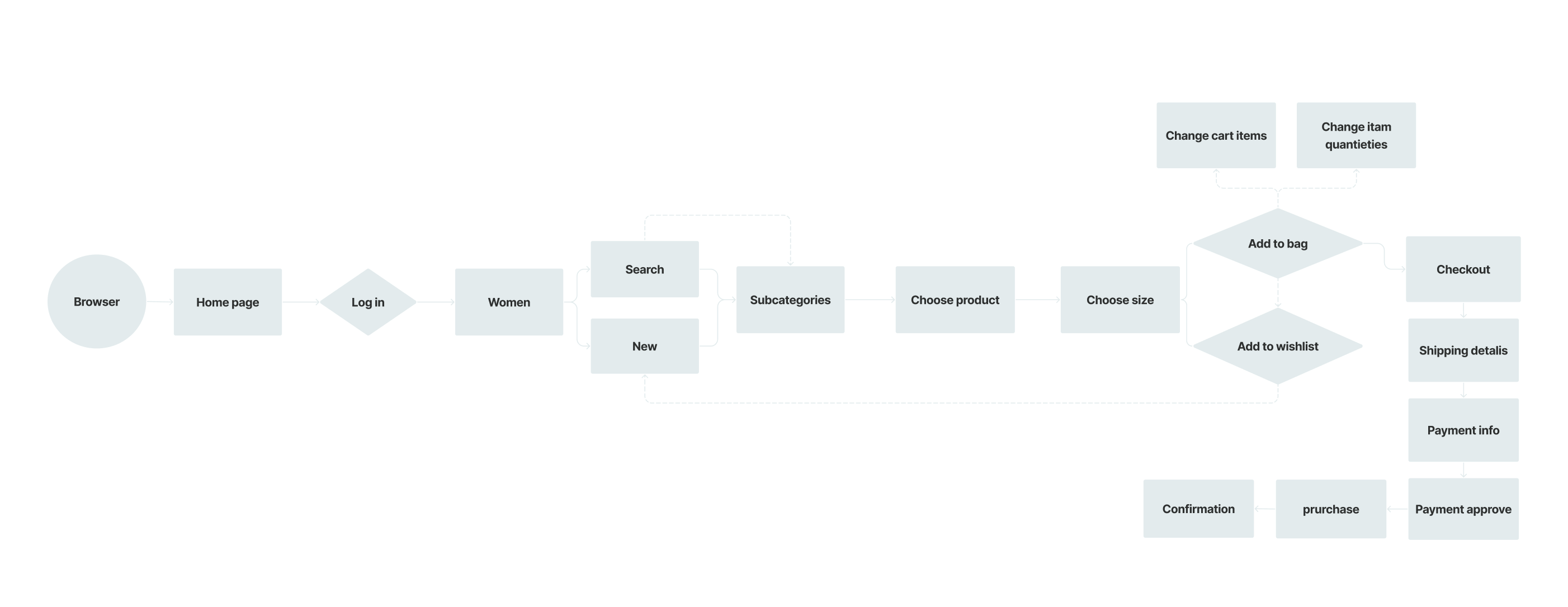
Why and how did we choose to change the user flow?
After looking at the existing site user flow and editing a site map, we noticed that the checkout process is too long. The purchase process is interrupted by another action required from the user in a form of registration or login. We estimated that this extra effort lowers the conversion percentage and therefore decided to separate the two actions.
Both the registration and the login into the personal profile will take place shortly after browsing the site through a pop-up window. The user will enjoy a personal area, a wishlist, and additional features that are only possible for those with a personal profile. In the same way, we will achieve a personal shopping experience, which was another goal of ours in redesigning. The second advantage, of course, is the fast and easy flow of the checkout process. When the user is already in the shopping bag, he is already registered. All his technical details are already there without any need for additional action. That will shorten the process and increase conversion rates.
Mid-Fi
Where has the side menu gone between Low-Fi and Mid-Fi?
When we started sketching the Low-Fi we were sure we would change the menu radically. We designed a side menu that slides into the screen when needed. As part of our goals, we set to reduce the visibility clutter on the product pages. We thought to design a leaner menu that opens as needed for a detailed sub-menu. After testing the prototype we realized there is a problem with the side menu! It is not convenient… Because we wanted to maintain the multiple filters (distribution that the users testified as excellent usability) the side menu that we created was long and required additional scrolling during use. This fact disqualified the side menu, and that how we returned to the top menu. We have divided the menu into main categories, and within a click the menu expands into sub-categories. In this way, we both reduced the clutter and created an easy and convenient user experience.
Hi-Fi
Style Guide
The choice of colors and design of the UI elements was a process of filtering and accuracy. In that process, my user persona led me. I wanted to turn the outlet mall into a cool and up-to-date mall to shop in. A place that people like to spend time in. I wanted to create a light and fun shopping experience that addresses trends and uses them in a more supervised way (e.g. neon colors). I wanted to combine young and contemporary colors, my inspiration was computer games from the 90s.
I was looking for a young sweetness and sophistication design-line. I design two-dimensional UI elements, a double and colourful outer line for the icons and buttons. The pop-up cards and the product card are partially rounded and repeated in a variety of ways. I used dark shadows and it givs the produce a flat look even for the highlighted elements. That is the playground for fashion and trend lovers.
Mobile
Mobile example
The site’s mobile version includes two screens and is an example of a full mobile version. The header and the footer breaking point are 320 pixels, and they are organized vertically. A carousel has been added to the home page to display the top products. On the product screens, to the menu, I added two top categories: “women” and “men” that filter some of the products. That the mobile menu will be more restricted yet precise for the user.