When I approached this exercise, I was looking for a goal I could commit to throughout the process. A product that I will be convinced that needs it and that needs to convince people to complete the task. I chose the organ donor card as a huge challenge to present a controversial topic that most people prefer not to think about. My goal was to increase the conversion numbers on the landing page.
User research
I started my research by reviewing existing pages for various organizations on the same topic (organ donor cards) around the world. My Insights were clear and identical in most cases.
Missing values – vulnerabilities: 1. Unaccessible. 2. Stressful. 3. Concentrates on the physical process. 4. Outdated. 5. Does not communicate with the user. 6. Does not emphasize moral and social values. 7. Does not address the motive of the user.
User Survey
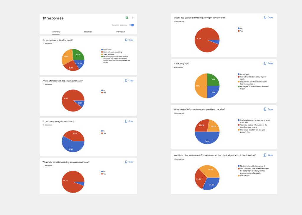
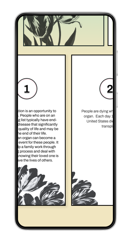
I conducted a survey of 19 respondents. From the answers, it can be deduced that most people know the card and would like to sign such a card, but the card is not accessible to them, and also the information they need to get to the signing stage. I realized that one of the key points in the project would be access to information. Another interesting point that led me afterward to my user flow, was the resolute division of the group of respondents into those who wanted to understand the medical process of organ donation after death while having a reluctance to the subject. They still believed in the goal and wanted to sign the card but did not want to get the exact description of the medical procedure.
How Might We Statements
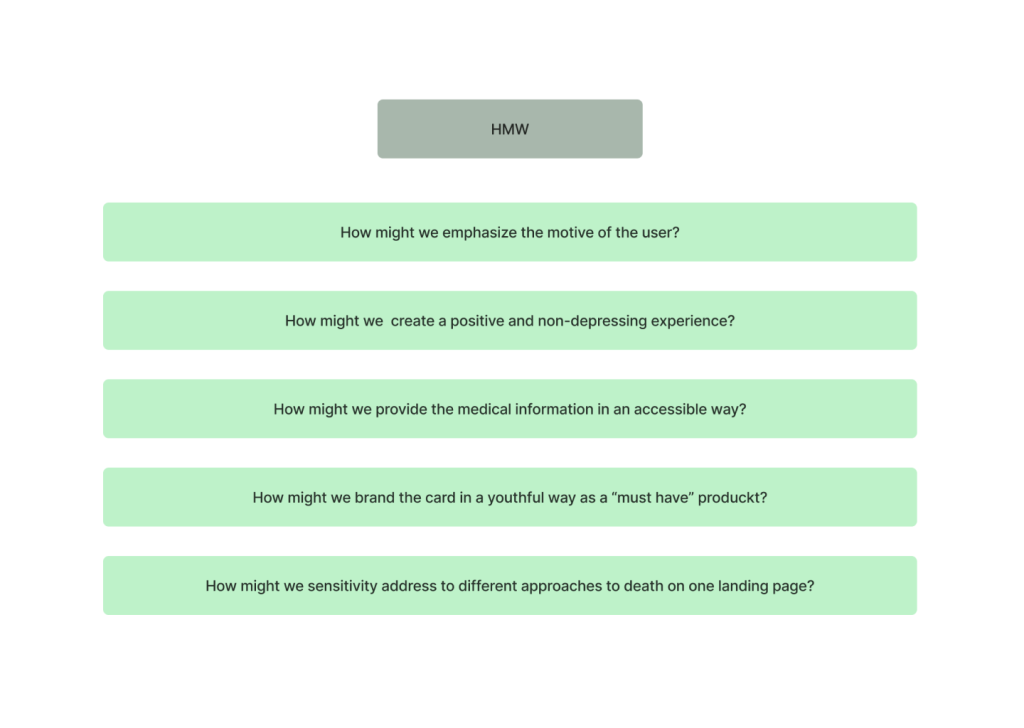
Because I believe focusing on problems is a way to find the solution, I like to use HMW questions. I was able to reduce the complexity to a number of questions that will guide me throughout the design process.
Analyzing the research results also helped me to come up with the brand attributes and understand the complexities inherent in the communication between the product and the user: Accessible, Advanced, Young, Cool, Humane, Informative, Updated.
User flow
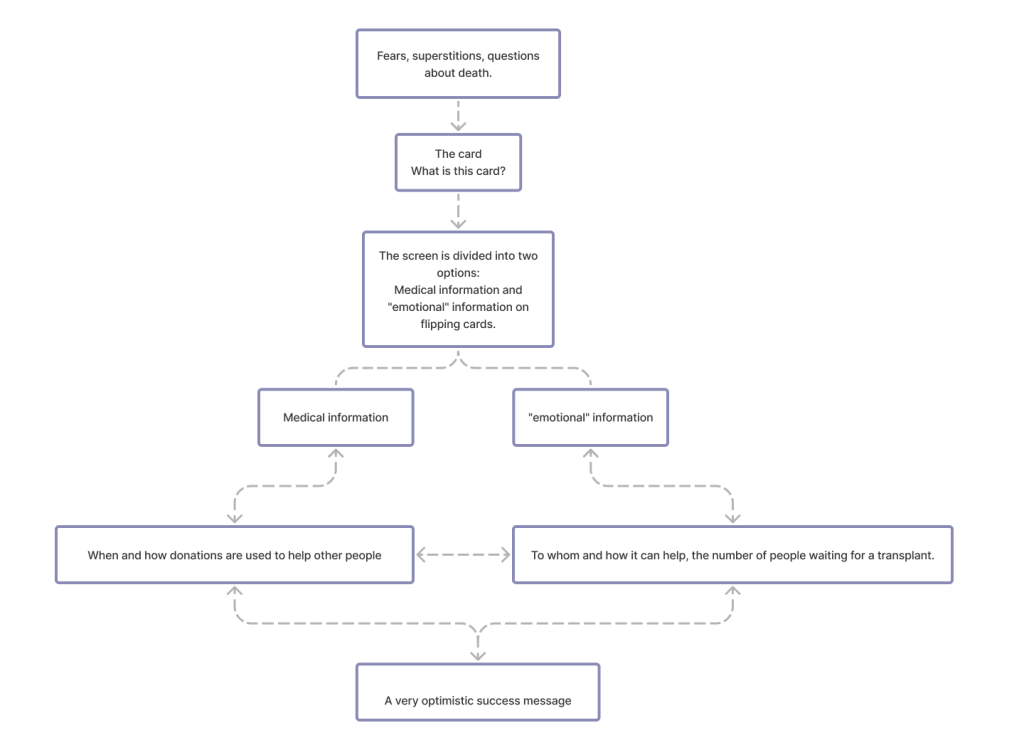
In my user flow, I wanted to find a solution to some major problems:
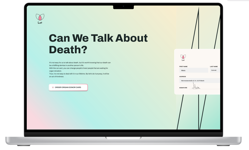
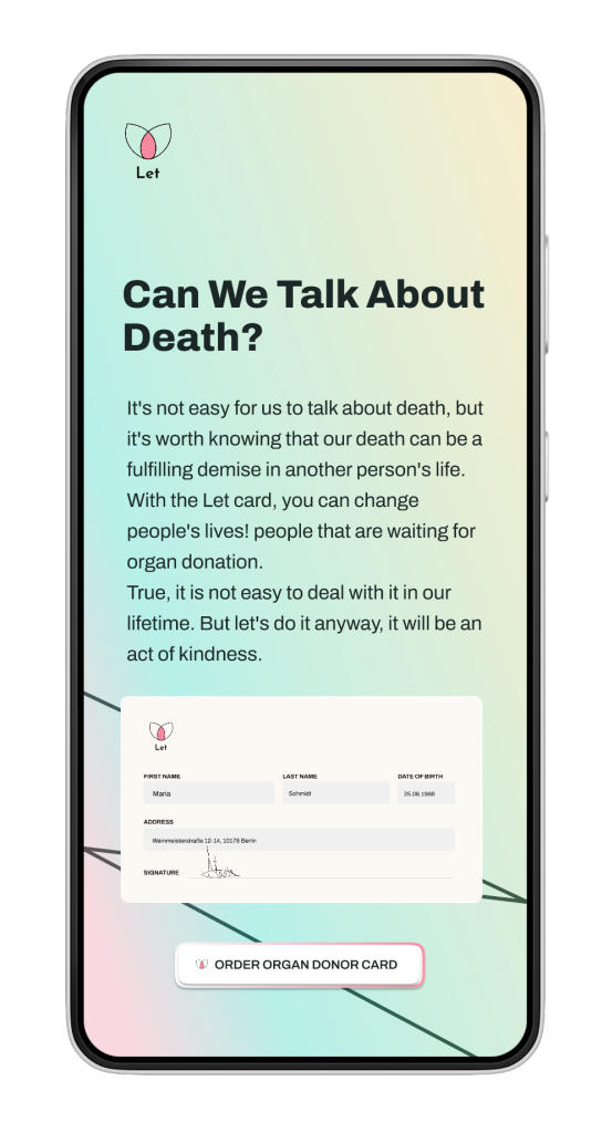
How to present a topic that is difficult to talk about? I decided that in order to talk about an unpleasant subject, it might be appropriate to talk first about the unpleasantness of the subject itself. So, I opened the home page with the personal story of many of us and the question “Can we talk about death?”. This question leads us to the beginning of our resistance story which I focus on.
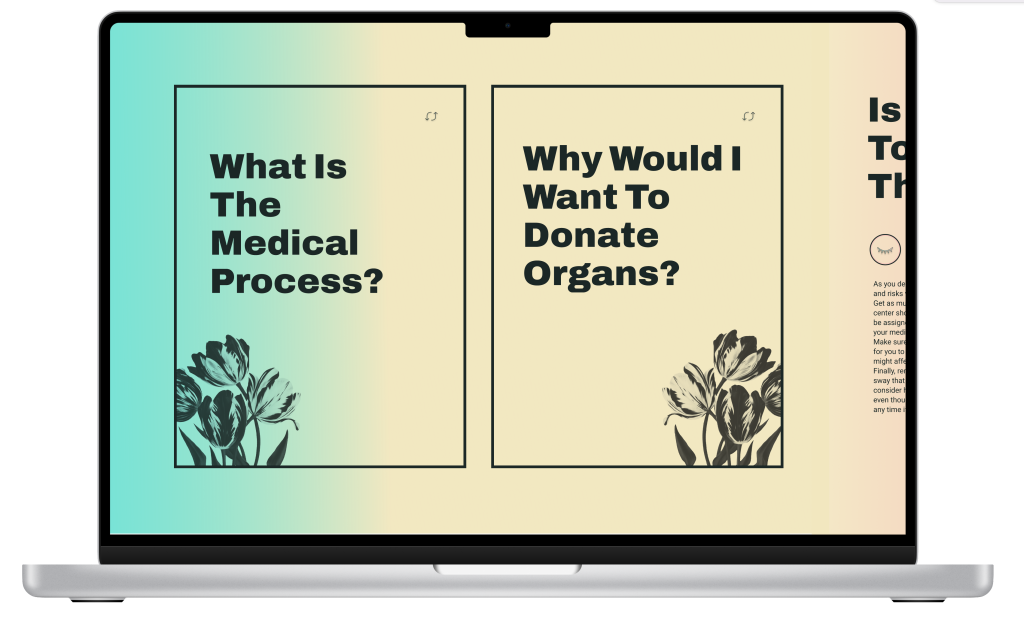
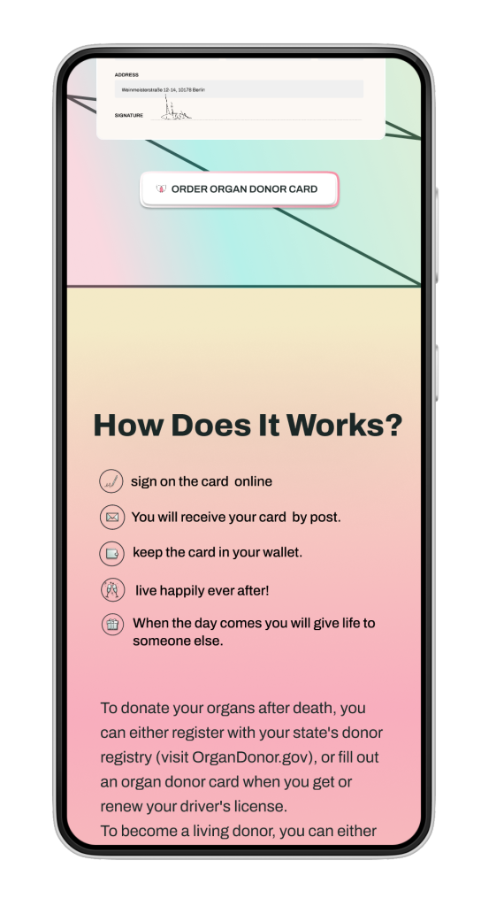
Medical information Yes or no? The user study revealed two groups that need a different approach: one is interested in the details of the medical process and the other wants to avoid talking about the issue.
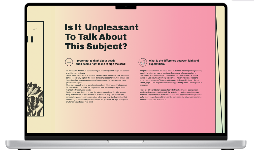
Fears and superstitions I decided to devote a page to addressing fears and superstitions, as there are many prejudices that can be easily refuted by information regarding organ donation.
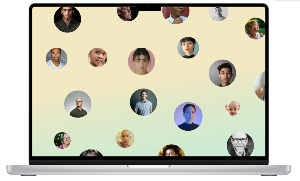
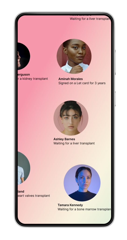
Identity and identification I wanted to turn the card into an accessory that identified with a young, conscious, and humanity, and represent a new world. I decided to create a grid of faces some of them donating and some waiting for donation to emphasize our great connection as human beings and mutual guarantee. and suggest the possibility that each one of us can be needed an organ donation.
Mid-Fi
Hi-Fi
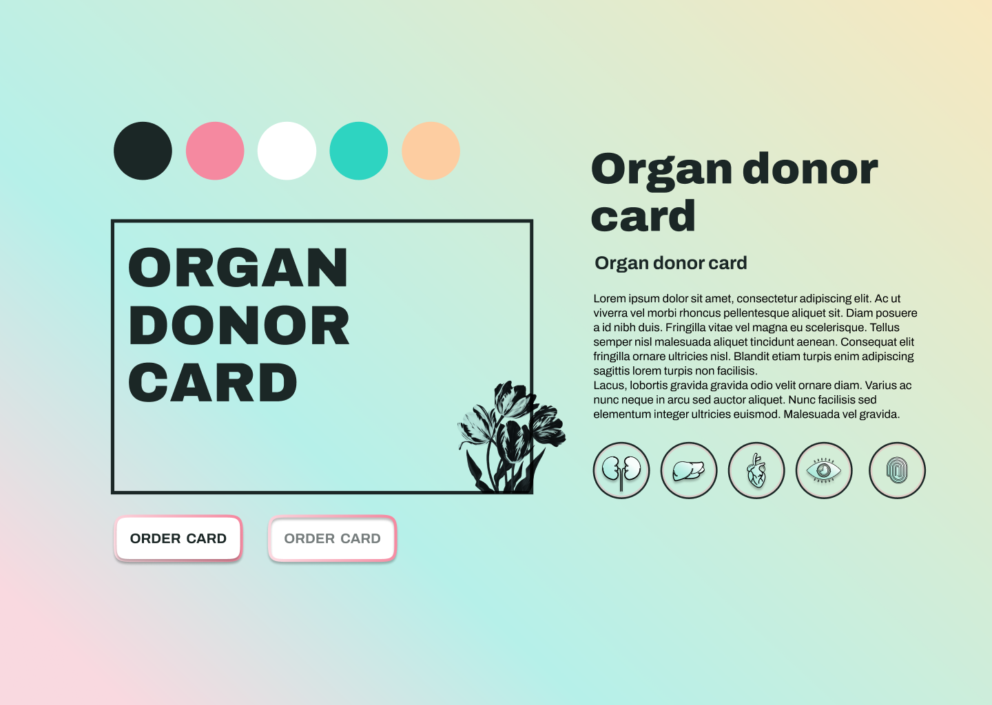
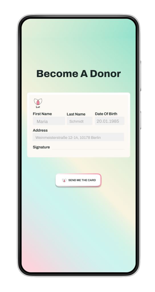
Style-tile
The principles that guided me in the UI design process were: Young, positive and calm colors, that communicate with a magical world and better ideas. Simple geometric lines represent the scientific and medical point of view, also the responsible side of this act. Illustration with a romantic touch, As a suggestion for a positive attitude towards death.